🛠️Configuration
Configure AppwriteCMS to fit your database.
AppwriteCMS was made with simplicity in mind. The whole configuration of AppwriteCMS will be stored in one JSON file, and you dont need any programming experience to configure it. This JSON file was made to work almost always, making most of the configuration optional. You can follow the guide and gradually fill your config file, slowly seeing the process you are making.
First, you open static folder, create config.json file in there, and open it in your favourite text editor. It's a plus if the editor supports JSON format, as it can mark if you create some syntax error by mistake. I would personally recommend using Visual Studio Code.
You can check out an example config.json I created for my own project with three collections: authors, articles, and news. The example config includes groups, dashboard, panels and bunch of different blocks, such as rich text, image, date or relationship dropdown.
Once opened, let's fill it with (for now) empty JSON:
Now we need to fill the JSON file, don't we? The file is split into multiple sections and each of them is explained in its own documentation below.
'appwrite' section
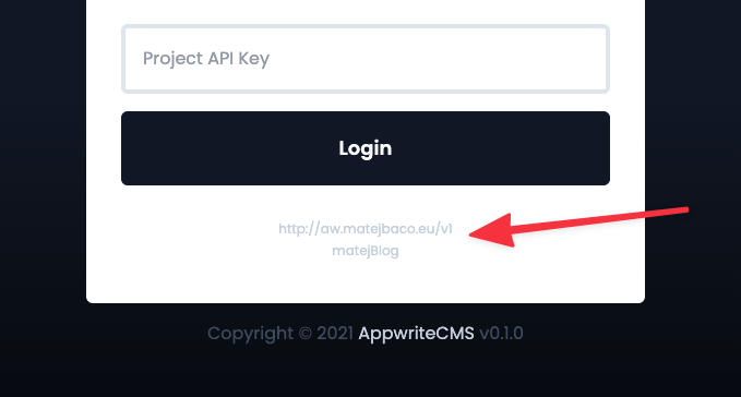
This section includes information about the Appwrite instance to which AppwriteCMS will be connecting. We will need endpoint and projectId configured, for example:
You can find these in Settings page of your Appwrite project. If configured properly, you will see this information in AppwriteCMS on the login page.
'theme' section
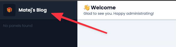
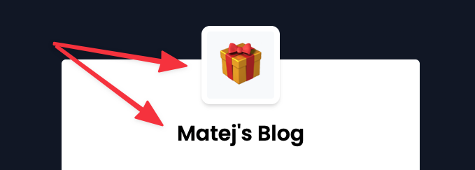
This section is used for personalizing the CMS. We can configure projectName and projectIcon, for example:
'settings' section
This section configures default values used by AppwriteCMS. We can specify multiple settings here:
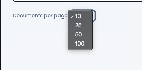
limitOptionsis an array of numbers, saying what limit options will there be if nothing specific is configured on the specific panel
Example of settings section:
'dashboard' section
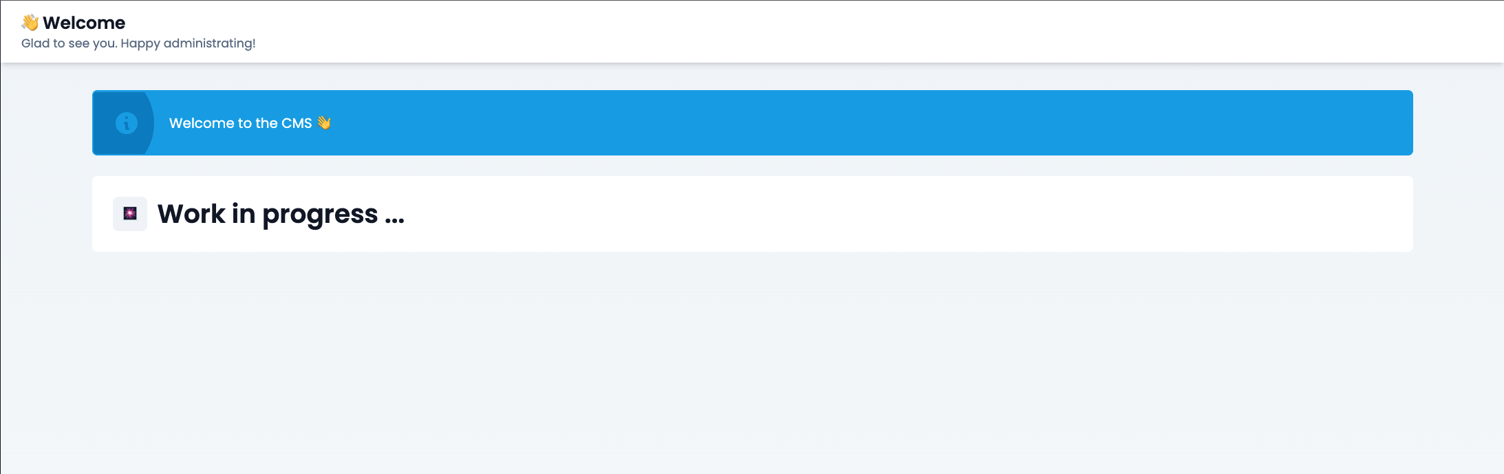
This section holds the configuration of the first page that the editor sees after logging into CMS. Here you can have some quick action buttons, graphs with stats, or a summary of activity in 24 hours. Imagination is your limit, but if you are not a programmer, you will have to use existing components.
We can confiture motd and blocks:
To learn more about 'dashboard' components, visit Dashboard Blocks documentation.
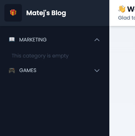
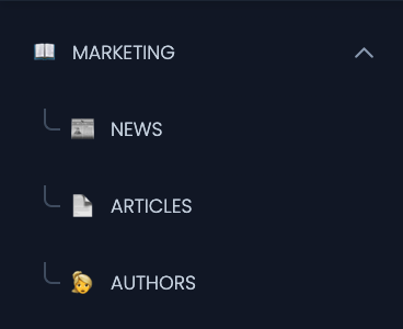
'groups' section
This section allows you to create logical groups of your panels (collections). A Basic website usually only holds a few collections, but a large website can use dozen of collections. Since scrolling through 50 options in a menu would feel terrible, you can use groups to group similar collections together.
Groups section js a JSON object where the key is ID of your group, and value is the configuration of your group. The group ID is never visible to the editor, but you should pick a reasonable name because you will refer to this group by its ID later when putting a panel under it. Every project can have multiple information configured:
nameis the name of a group visible to the editor.iconis a small emoji icon displayed near the namemenuSortis a number explaining where exactly in the left menu should the group be placed. A higher number means it will be lower in the menu treeisOpenedByDefaultis a boolean saying if this group should be opened by default when the editor visits the pageparentGroupIdcan be used to configure the parent group of a group. This allows group nesting, and it is optional. If a group does not have a parent, it means, it is on a root level
Example of two fully configured groups:
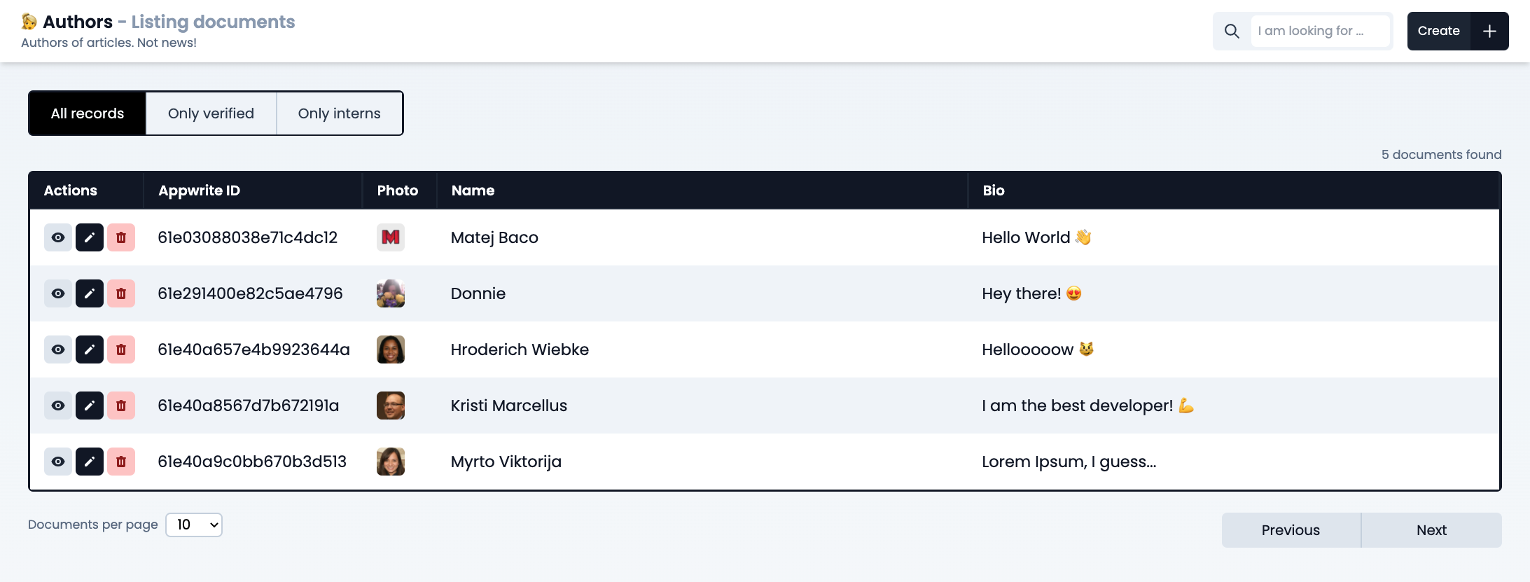
'panels' section
This section provides configuration to all panels (pages) of our CMS and each panel maps one-to-one to each collection in your Appwrite database.
The panels section is a JSON object where the key is ID the collection in Appwrite, and the value is a configuration of our panel. Every panel can have multiple information configured:
nameis the name of the panel visible to the editoriconis emoji icon of the collection displayed alongside the namedescriptionis a short description of the panel visible on top of the panel page
groupIdis string ID of a group to which this panel belongs. It can be omitted if the panel does not belong under any group
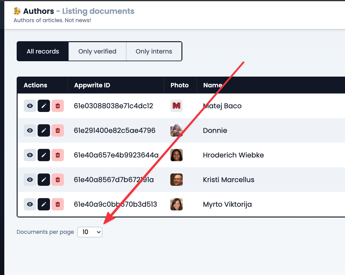
menuSortnumber explaining where exactly in the left menu should the group be placed. A higher number means it will be lower in the menu treedefaultLimitnumber specifies which limit option should be picked by default when you visit the panel page. This number should be one of the limits provided inlimitOptionsundersettingssectionsearchAttributestring is an attribute key from Appwrite that will be used when searching using an input.
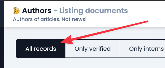
labelsobject where the key is ID of the label (visible in the URL), and value being label configuration. The configuration includesname(visible to editor),queriesandsortsconfigurations reflecting what Appwrite's listDocuments. To learn more, see example below.hideAllRecordsLabelboolean allows you to disable the defaultAll recodslabel that shows all documents without any filters
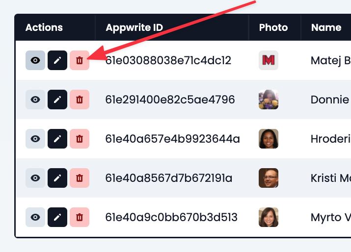
canDeleteDocumentsboolean value letting you to choose if editors can delete existing records or not
singletonis a string value. If left empty, the panel is not treated as a singleton, and will properly show the list view. If we set singleton, the list view will be skipped and you will see the detail of the record when visiting the panel. The string should be set to the ID of the document that is a singleton in your collection. This option is really useful for panels like "settings" holding "contactEmail" since your website only needs one record for settings.actionsobject holdingcreate,list,editandviewobjects, each of them configuring different action.
Example of a panel with all properties configured except actions:
Let's finish configuring panels by looking at how each action can be configured.
'list' action configuration
List configuration explains what columns are there in the table when listing records. It needs to include array of blocks, each being object with the following keys:
nameof the column in the tableattributestring of Appwrite's attribute key to which this block mapstypestring being type of the componentconfigjson object holding component configuration for the specific typewidthof the column in the table (maps to css style)
Example of list action:
To learn more about 'list' components, visit List Blocks documentation.
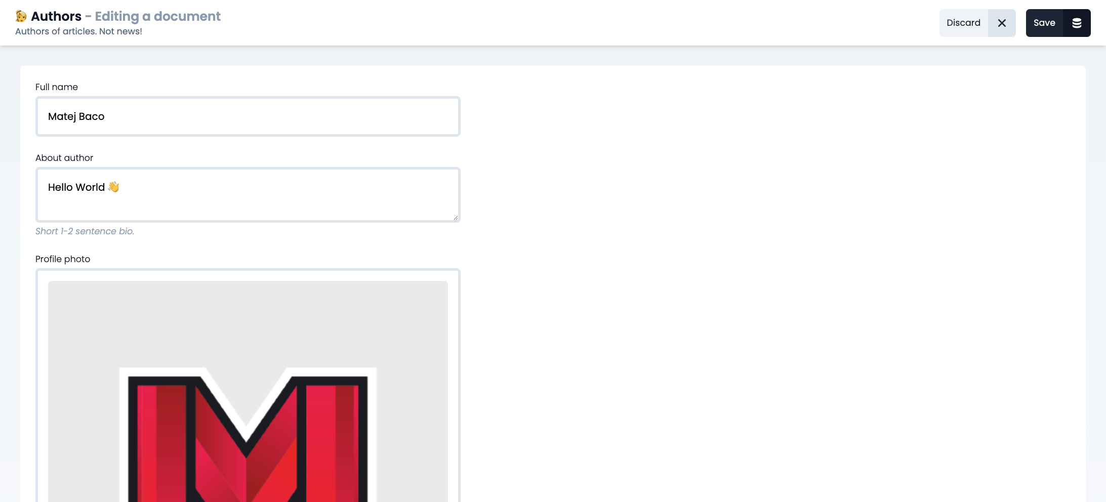
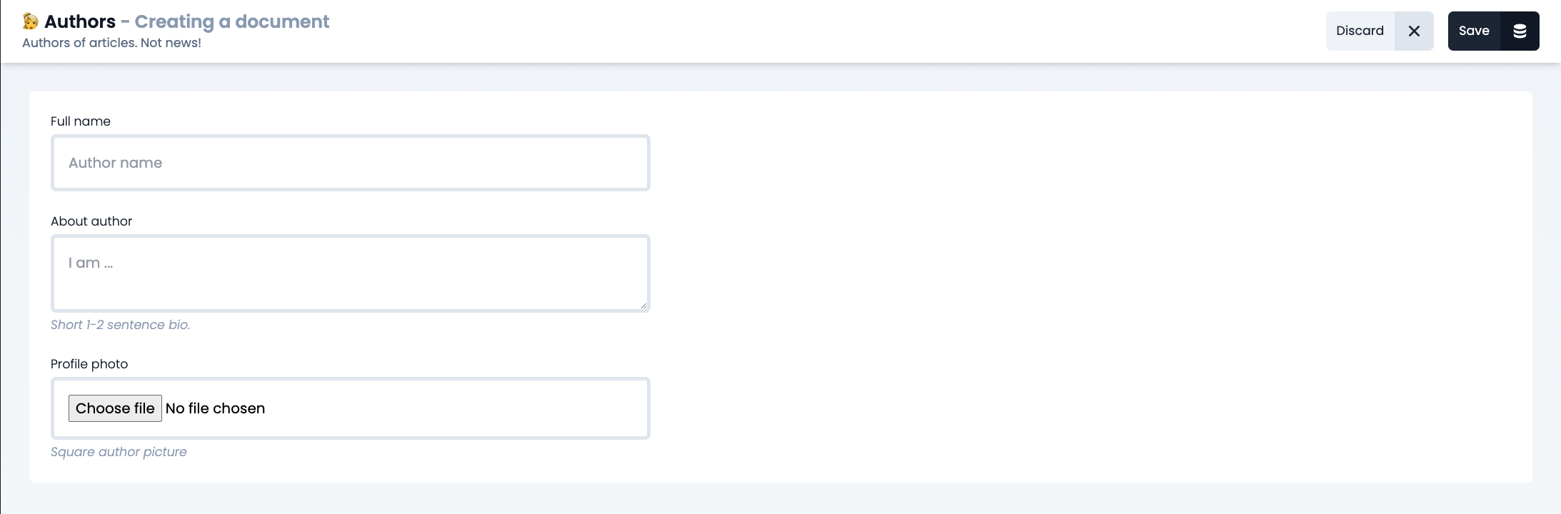
'create' action configuration
Create configuration explains what inputs are there in the form when creating a new record. It needs to include an array of blocks, each being object with the following keys:
nameof the column in the tableattributestring of Appwrite's attribute key to which this block mapstypestring being type of the componentconfigjson object holding component configuration for the specific typenotesmall text visible just below the form section of this attributearrayboolean specifying if this attribute is array or not
Example of list action:
To learn more about 'create' components, visit Form Blocks documentation.
'edit' action configuration
Edit configuration explains what inputs are there in the form when editing an existing record. Its configuration allows exactly the same properties as 'create' action, but since most of the time you want the edit action to be exactly the same as create action, there is a handy shortcut. To tell edit action to copy create action, you can use blocksReflectCreate attribute:
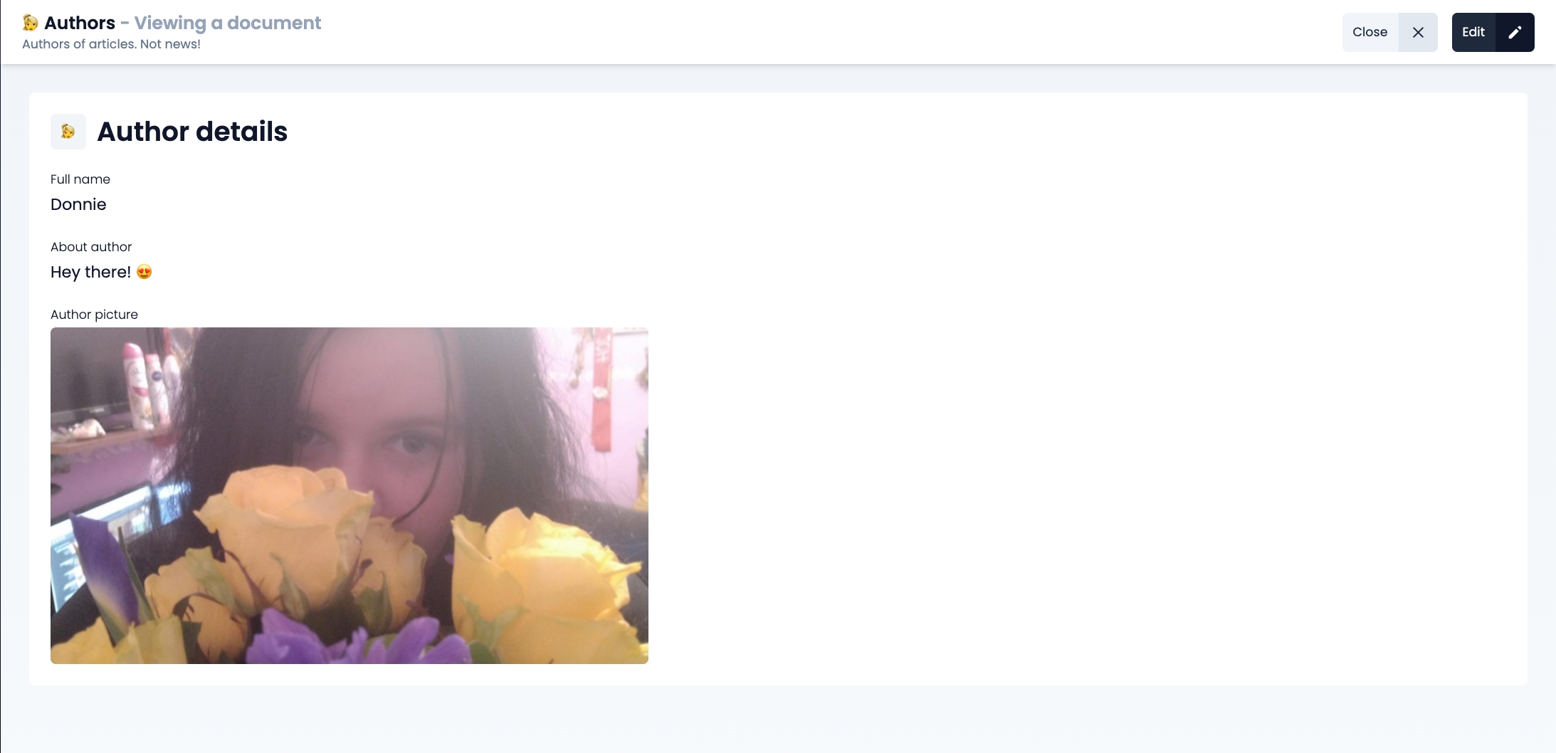
'view' action configuration
View configuration explains what data are visible when displaying detail about one specific record. It needs to include an array of blocks, each being object with the following keys:
nameof the column in the tableattributestring of Appwrite's attribute key to which this block mapstypestring being type of the componentconfigjson object holding component configuration for the specific typenotesmall text visible just below the form section of this attributearrayboolean specifying if this attribute is array or not
Example of view action:
To learn more about 'view' components, visit Detail Blocks documentation.
Last updated